I’ve seen many t-shirt sale websites featuring a series of very entertaining designs that mimic the illustration style of children’s books from the 60s, 70s, and part of the 80s with an ironic twist. I’ve really liked this style, so I’ve decided to create my own and explain how I did it.
To begin, let’s look at some classic examples that will help us identify the characteristics of these drawings:
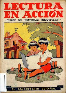
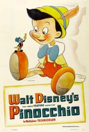
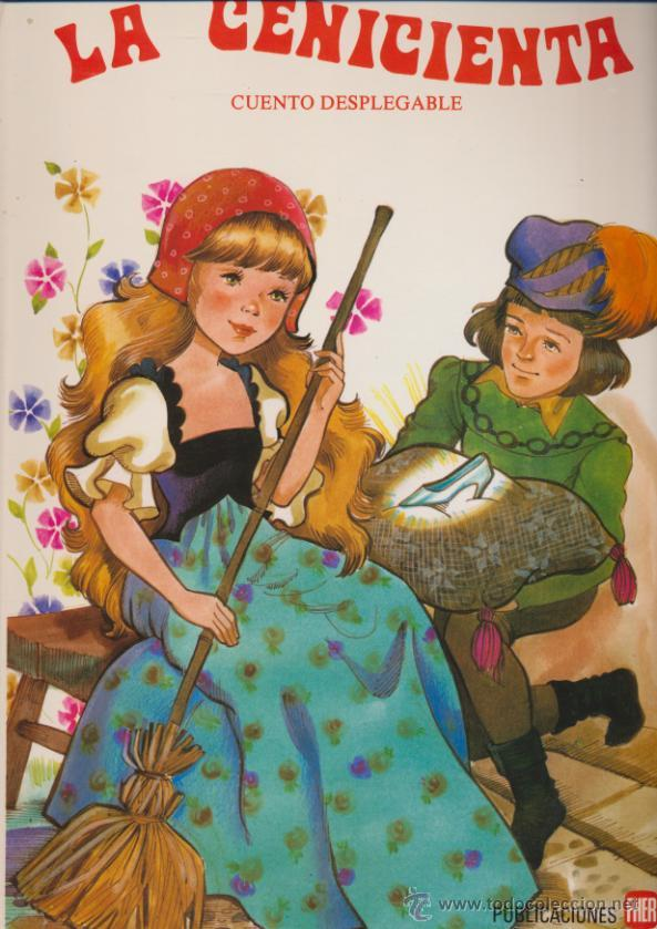
As you can see, all of these examples share several characteristics:
- Use of bright and vibrant colors: Illustrators used a cheerful color palette to capture the attention of children. Colors were often vivid and saturated.
- Simple and geometric lines: They employ simple lines and easily recognizable geometric shapes to make the images accessible and understandable.
- Two-dimensional illustrations: Often, illustrations in this style were created without much depth or shading. This helped create a clean and clear look on the pages.
- Expressive characters: They feature highly emotive and exaggerated facial expressions, making it easy for children to identify the emotions of the characters.
- Use of popular themes of the time: Although it’s used ironically or as a statement nowadays, this style also addressed popular trends of the era, such as the civil rights movement, counterculture, space exploration…
- Educational and moral messages: Many children’s books from the 1960s and 70s had an educational and moral dimension, with stories conveying important lessons and values to children.
Part of these characteristics make up the so-called ‘naïve’ style that became popular at the time. This style aimed to represent reality in a simplified way through a simple style and the absence of realistic details, which gave the drawings a friendly and appealing look for children.
Step One: Choosing the Theme

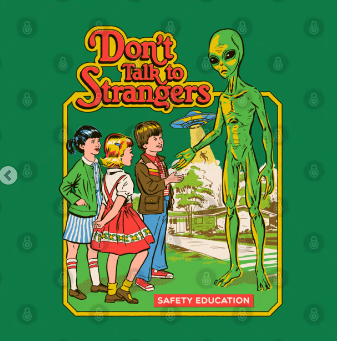
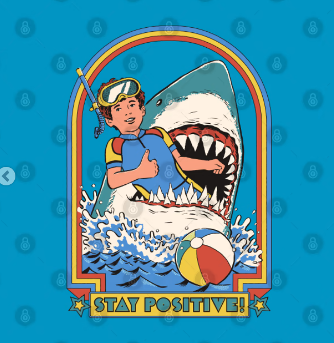
The images you’ve just seen are contemporary examples following the guidelines of this style, but with a more modern message. As we can see, they all aim to exaggerate a situation, use irony, and create one impasse…
To choose your idea, it’s best to do a little brainstorming and jot down the ideas you like the most. When you have several ideas, you can select the one you like the most. You should also consider whether you can execute it.
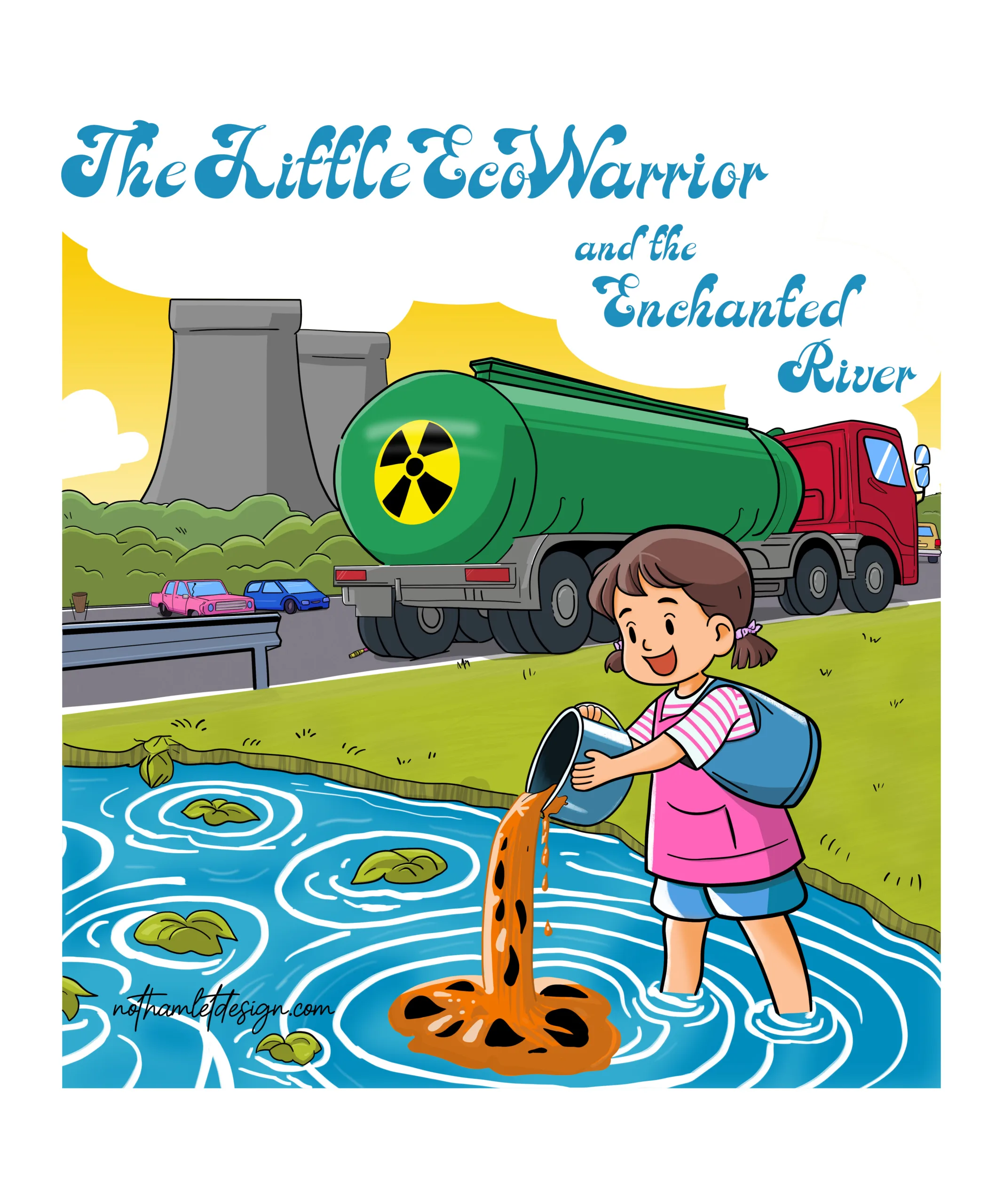
In my case, among all the ideas, I particularly liked the concept of a “book that tries to teach you how to pollute,” and I came up with the idea of drawing a girl polluting a river in a natural environment.
Develop the Sketch
Once we have the theme and the idea, we need to start creating it. It’s best to search the internet for similar examples of what you want to do. Nowadays, you can also generate an image with AIs to serve as an example.
With all of this, we can start drawing. You need to ensure that the composition’s layout is balanced and consider 2 very important things for this style:
- The text has to be a part of the image. It should be seen as a whole, not as an element separate from the drawing.
- The image should represent the concept you’ve thought of as much as possible, but using the fewest elements possible to do so.
In the future I will make a post with tips and techniques that help create a good composition that can complement this article.
My sketch was this:
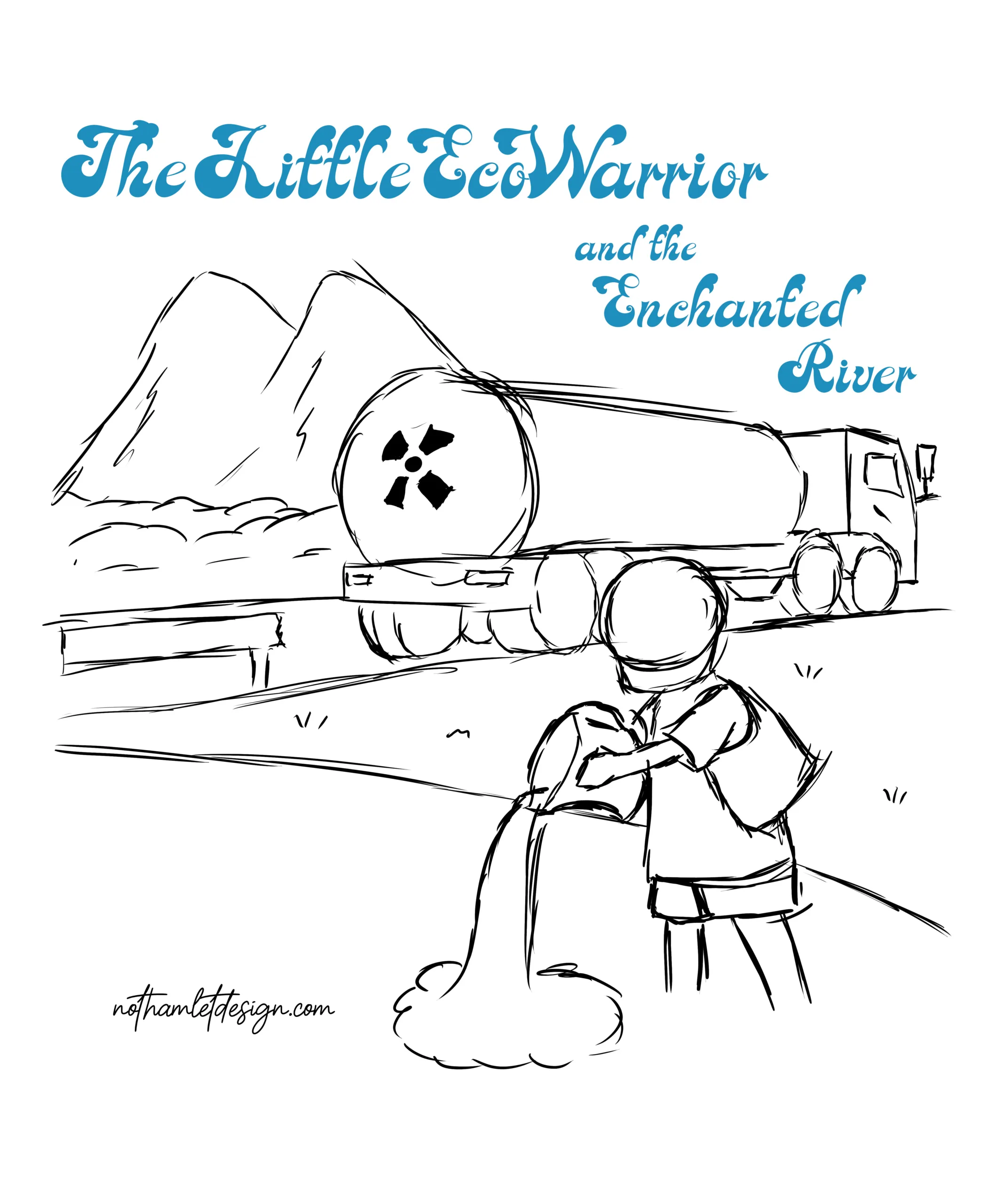
It can be even more basic and geometric than this. The important thing is to create a scheme and then perfect it. Evolve the sketch until you are clear that this is the final version you want to carry out.
Define the Line
Once you have developed your sketch to the fullest, it’s time to “clean it up.” In this drawing style, the simplest way is to draw its line.
You must keep in mind that for this particular style, you should:
- Work with defined and precise lines.
- Detail the elements of the drawing as minimally as necessary.
- Use the same type of brush (if possible).
- Erase all unnecessary lines. This will help the defining lines stand out more.
If you follow these tips, you should achieve a result like this:
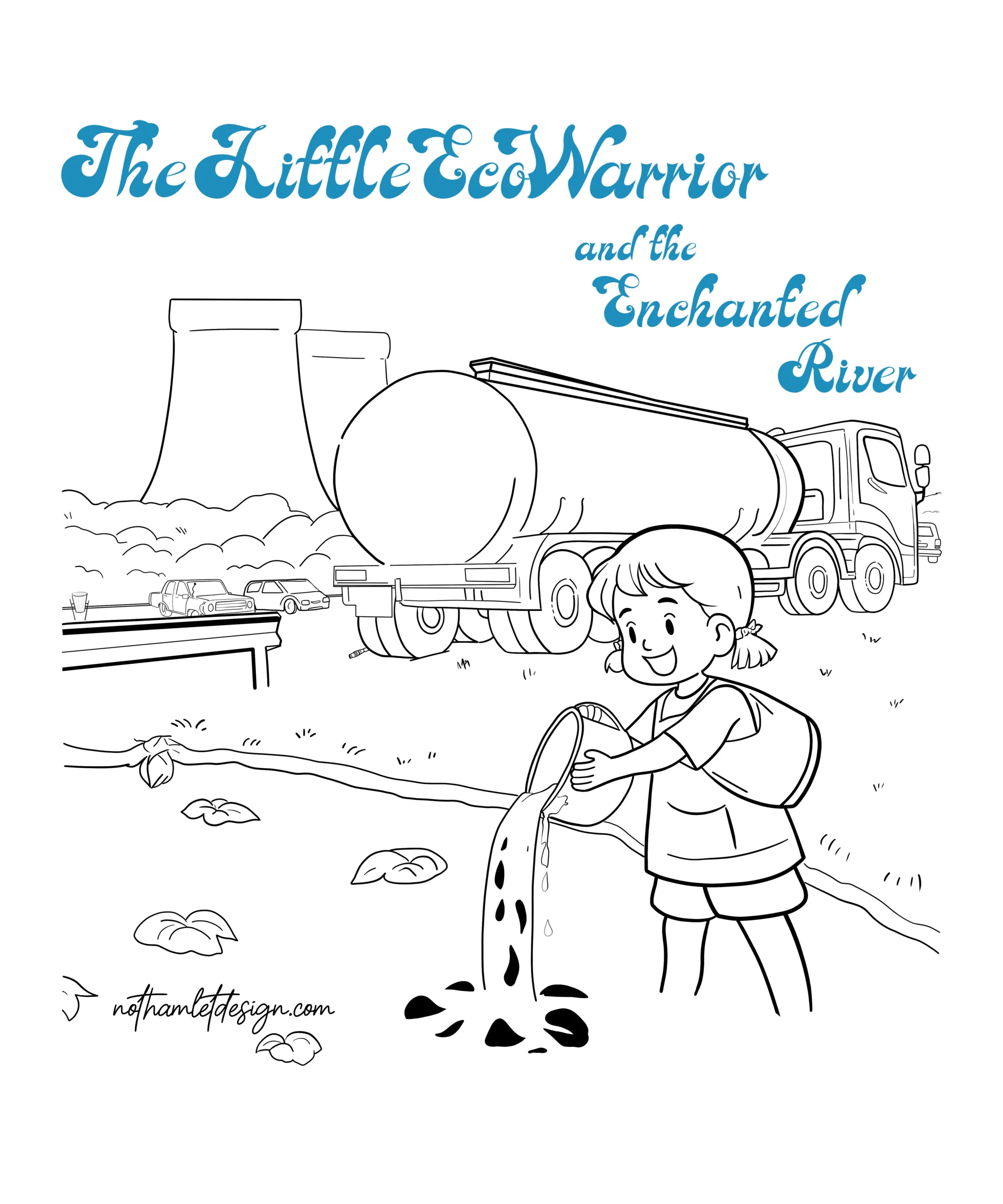
As you can see, I evolved the drawing by changing things like the mountains and adding a few elements that balance the composition and reinforce the message that the image should convey.
Spot Colors
For many of you, this step will be the last. With flat colors (without shadows or highlights), you can already achieve a very nice drawing.
Although coloring may seem very simple, it’s important to consider a few things to capture the essence of this style:
- Use bright and saturated colors that grab attention.
- Basic primary colors like red, yellow, and blue are essential, as well as green.
- You can use pastel colors to give it a retro touch.
- Simple textures and patterns like stripes, dots, or squares can be used, but don’t overdo it.
In the end, it’s as simple as imagining that for the drawing, you only have the typical 12-color pack that children use, and you can only use those colors. If you’ve followed these steps, you should end up with something like this:
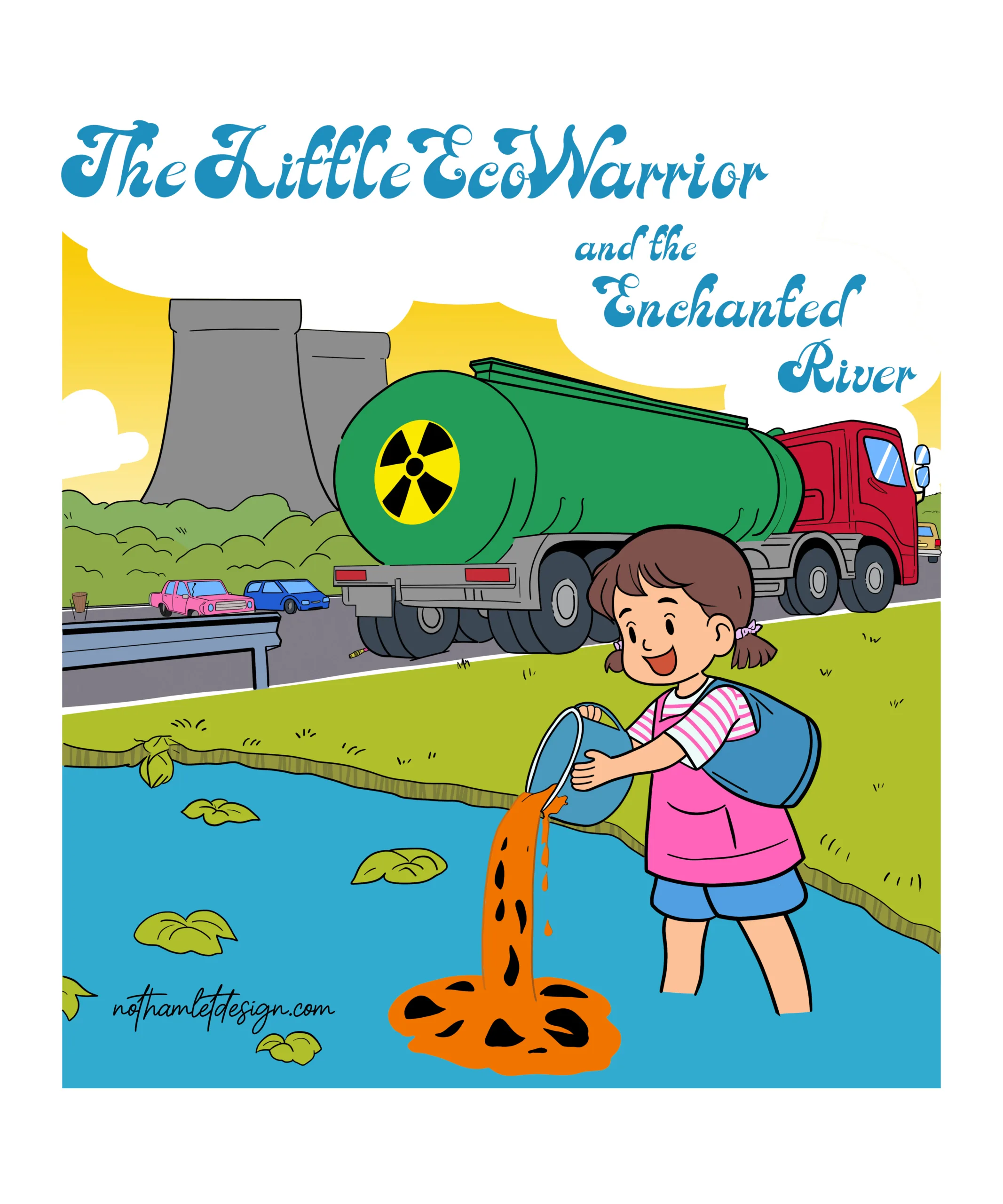
With this, you already have a more than convincing result. As you can see, I’m not using more than 6 colors with some tonal variations. I’ve used a small stripe pattern exceptionally on the girl’s T-shirt because it’s the main element and can be more detailed.
Shadows and Lights
We could be talking for weeks about how to apply shadows and highlights without repeating any topic. Now, we’ll just look at what you need to consider when doing it in this drawing style:
- Shadows and highlights should be flat colors, without gradients or blending.
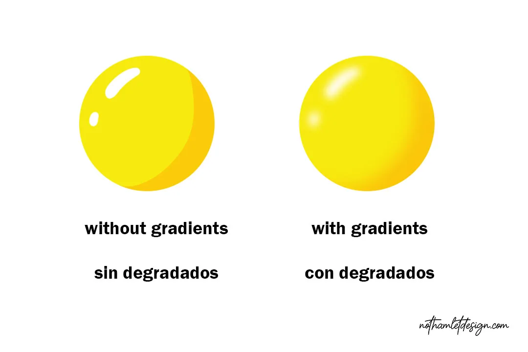
- Each element in the drawing should have only ONE shadow and ONE highlight. If some element needs more, you should use the fewest shadows and highlights possible.
- Areas that should be darker (inside a sleeve, a fender, the interior of a can…) can be painted directly with black or a very dark color.
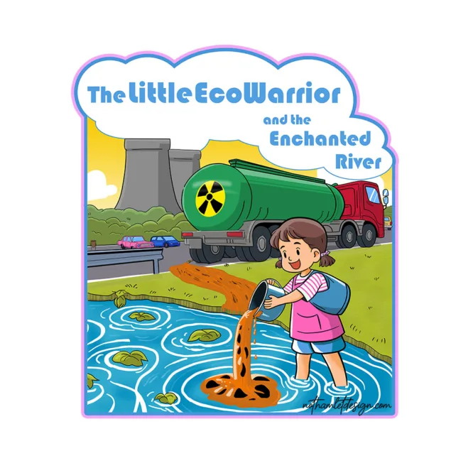
If you do it correctly, the drawing will have more depth, but be careful because if you detail the shadows and highlights too much, it will look too realistic. It happened to me, and I had to correct the drawing until I got this result:
Final Corrections
As you can see in the previous drawing, the font of the text doesn’t match the other elements. This often happens many times; you come up with an idea with a certain text style, but as you finish the drawing, you realize it doesn’t quite fit. The only option is to change it and find another one that fits. Here’s a list of fonts commonly used in the ‘naïve’ style that can serve as a reference.
After having corrected the font and added a frame, this is the final result:
I hope it has helped you achieve the result you were looking for. See you in upcoming articles.